Best Combinations for Modern Office Paint Colors
The right modern office paint colors can reshape a workspace by influencing how employees feel and perform throughout the day. Believe it or not, colors have the ability to boost productivity, lift moods, and still establish a professional atmosphere. Smart color combinations bring a fresh and inspiring vibe to any office, be it a traditional work setting or a creative corporate setup. Let’s explore the best colors for office walls to cultivate a dreamy and dynamic work environment.
5 Amazing Modern Office Paint Color Ideas
Office paint colors have a direct impact on employees. The globally-believed color psychology shows that blue encourages concentration, while yellow pushes you for creativity. Incorporating a modern office color palette helps establish a cohesive design throughout the workspace, tying together elements like walls and furniture for a unified and inspiring setting.
1. Set the Right Tone for Your Workspace with Modern Color Vibes
Blue for Focus and Communication
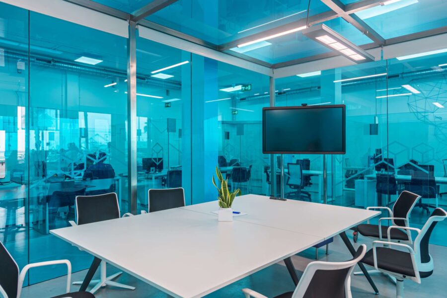
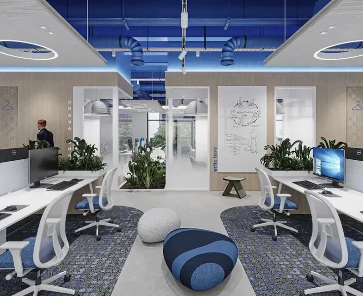
Blue is the best color for office walls as its chic factor and has the ability to promote focus, creativity, communication, and calm. It’s especially effective in task-oriented areas like meeting rooms where proper communication and innovative thinking is essential; or private workspaces, where concentration is the most important factor. Blue reduces distractions and supports clear thinking by stimulating our mind. So, with blue on the walls or in accents, the possibility of employees staying engaged and communicating with clarity gets amplified.
Yellow for Creativity and Energy
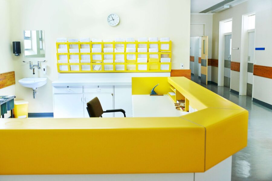
Yellow sparks creativity and energizes the workspace, which makes it an excellent fit for brainstorming rooms or collaborative zones. Its bright and enthusiastic nature brings optimism, helping teams feel more inspired and motivated. Above all, yellow infuses spaces with energy, and people with self-esteem, driving breakthrough solutions and innovative thinking.
Red for Power and Action
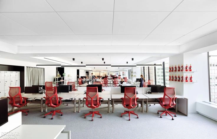
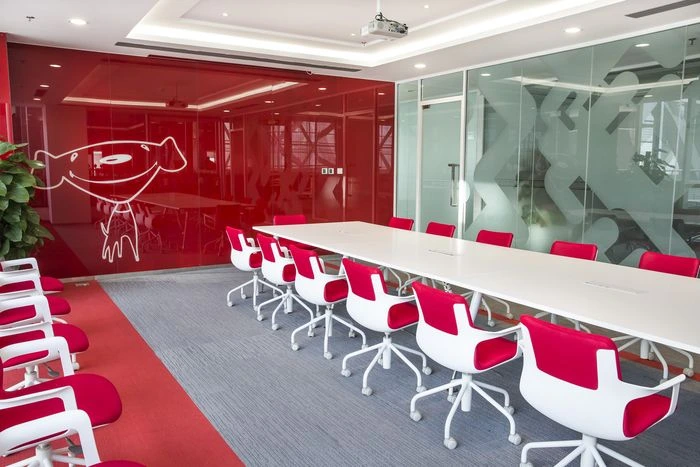
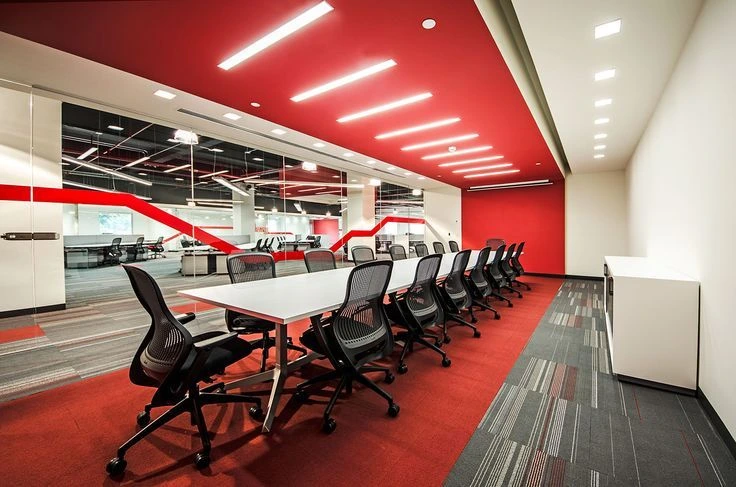
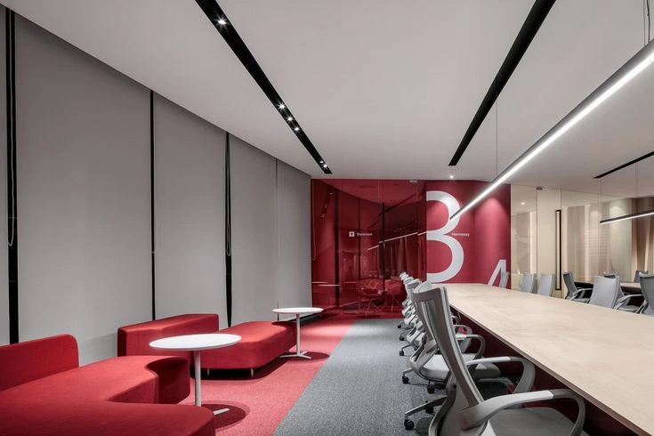
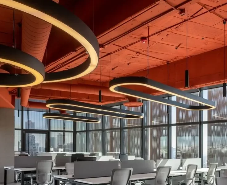
Red is all about bold energy. This powerful shade injects intensity and alertness and is well-suited for high-pressure areas like sales departments or fast-paced teams. Its fearless presence stimulates action and urgency, encouraging dynamic work. However, it’s best to use red sparingly, preferably in accents or feature walls, to avoid overwhelming the workspace.
Orange for Energy
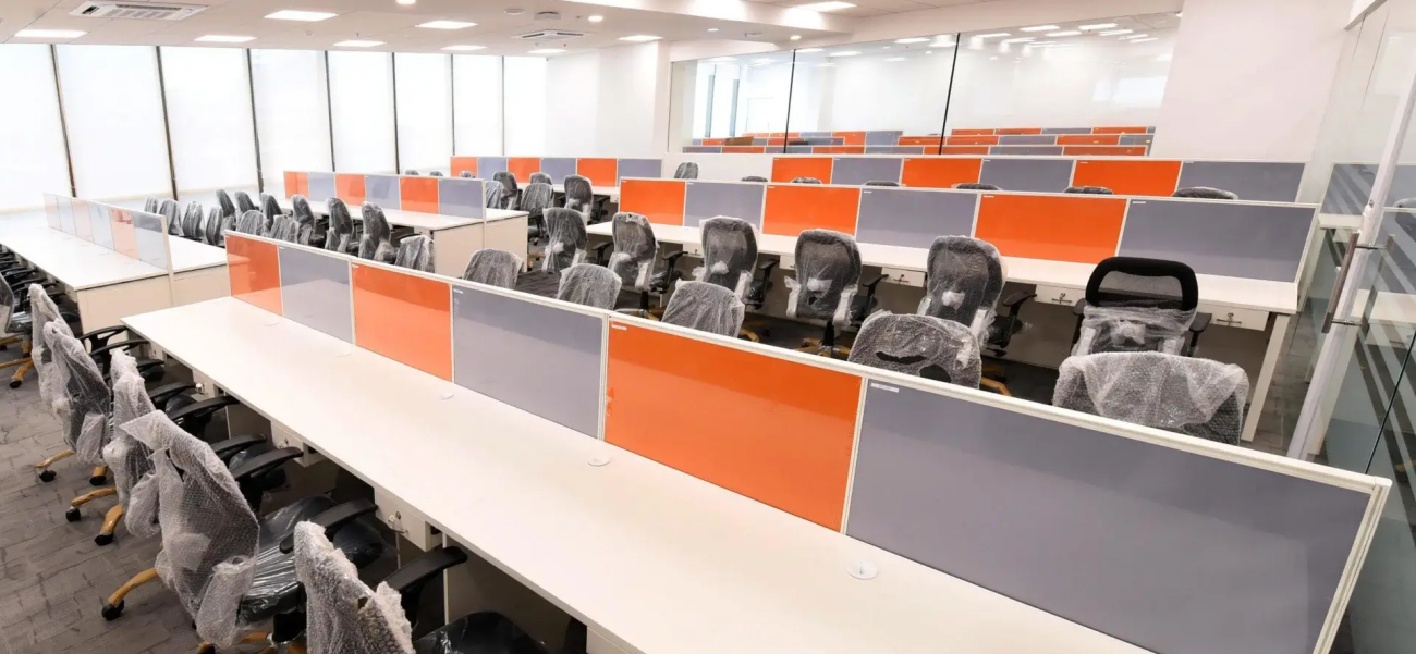
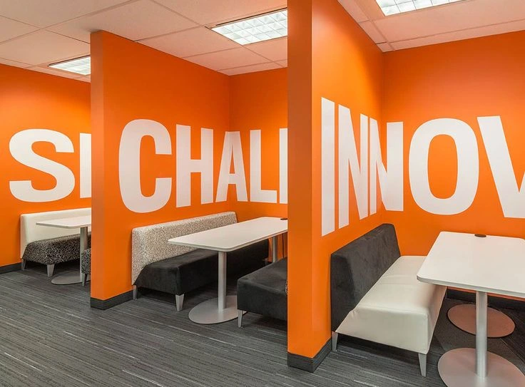
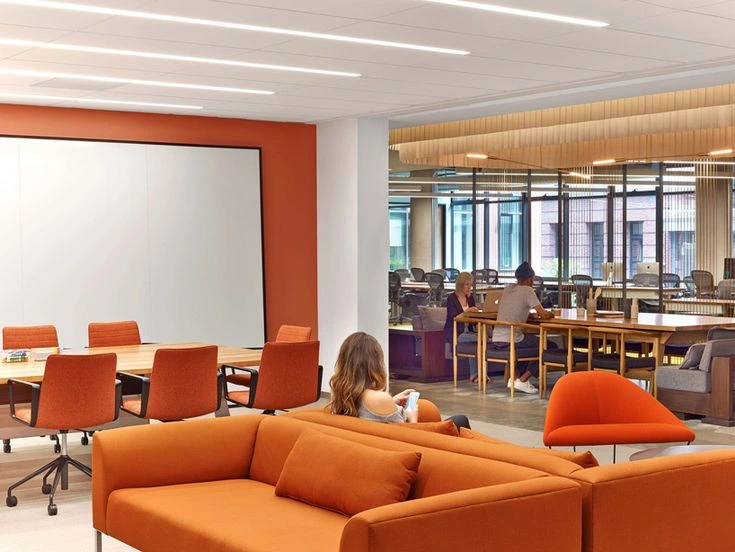
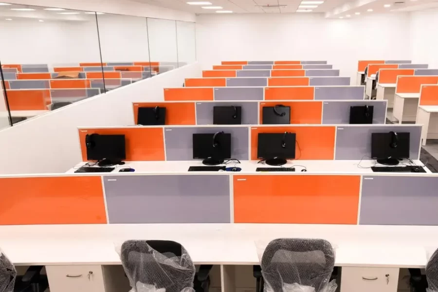
Orange brings a burst of enthusiasm and energy to the office as it’s a combination of red’s vitality and yellow’s optimism. This office paint color prevents boredom among employees and keeps them engaged, especially in creative or high-energy spaces. Use orange in a feature wall, artwork, or accents like chairs or decor for a lively environment that doesn’t overwhelm the senses.
Green for Refreshment
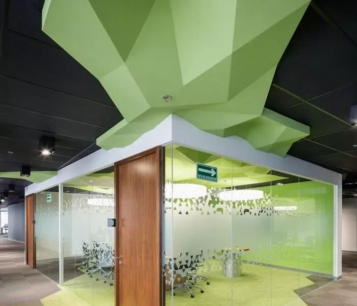
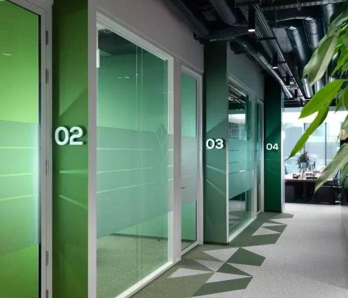
Green brings a feeling of calm and rejuvenation to the workspace, which is important for clear thinking. Green tones are ideal for common areas, break rooms, or open-plan offices, creating a refreshing atmosphere. Employees feel less fatigued and more at ease with green shades around as it helps them feel rested and recharged. Along with painting accent walls, the best way to introduce green is to bring in some foliage.
Grey for Sophistication
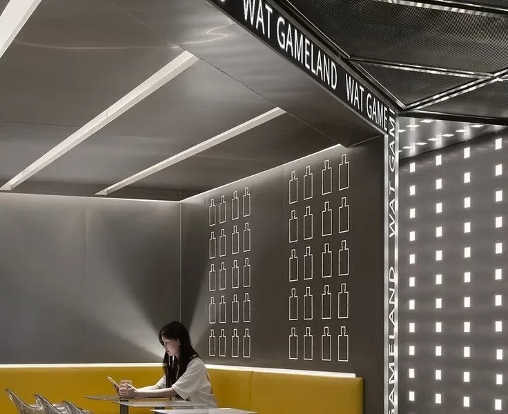
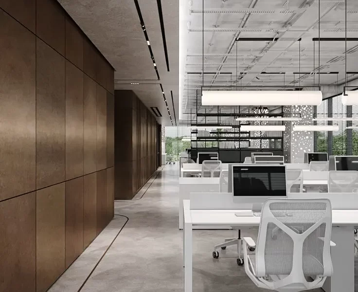
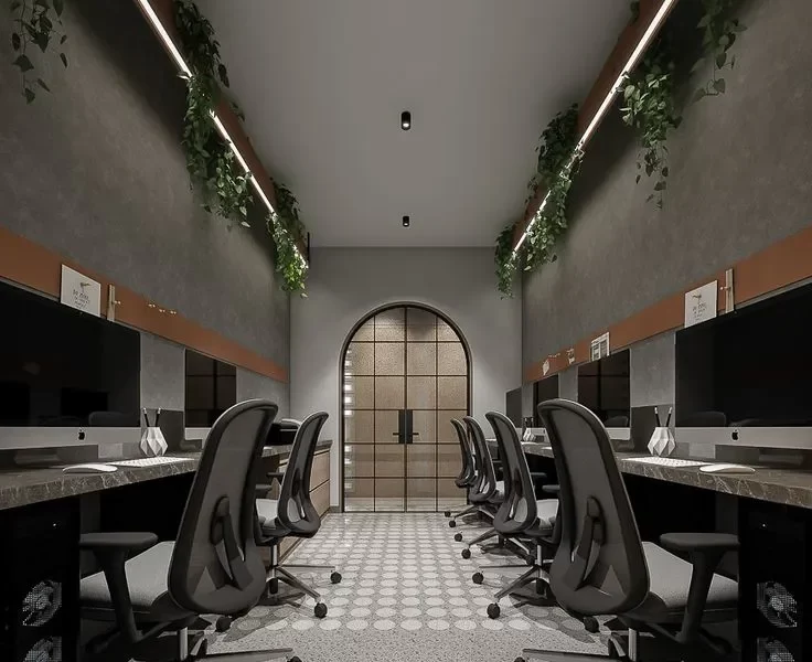
Grey falls in the category of contemporary office colors. It evokes professionalism and stability, which makes this hue perfect for executive offices and meeting rooms. Its neutral tone creates a sleek, minimalist modern backdrop that pairs well with brighter colors, promoting focus and a calm, balanced corporate atmosphere.
Purple for Prestige
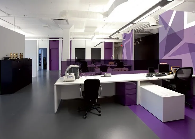
Purple is associated with creativity and confidence, so it’s an excellent choice for creative industries like design or marketing spaces. This color brings a feeling of luxury and sophistication, motivating teams to come up with out-of-the-box ideas. Incorporate purple through accent walls or subtle touches like purple artwork or carpets to instill a feel of prestige and imagination in the workspace.
2. Find the Perfect Color Combination for Your Office
Creating Balanced Combinations
Adding bold accents with neutral tones gives depth and character to a workspace without overpowering the layout. Mixing modern office paint colors such as gray and yellow, white and green, and blue and white can create a contemporary, pristine appearance, which looks sleek and keep’s the office’s professionalism intact. Muted tones provide a peaceful base, while vibrant highlights add excitement and personality to a workplace, enabling you to achieve the ideal fusion of tranquility and liveliness.
Experimenting with Color Pairings
Don’t hesitate to try out new color combinations. Go all out by pairing pastel walls with bold furniture and accents like rugs; or combine bold, colorful walls with neutral furniture. These contrasts can create dynamic, engaging spaces that feel fresh, futuristic and creative without being too intense.
Complementing Your Brand’s Identity
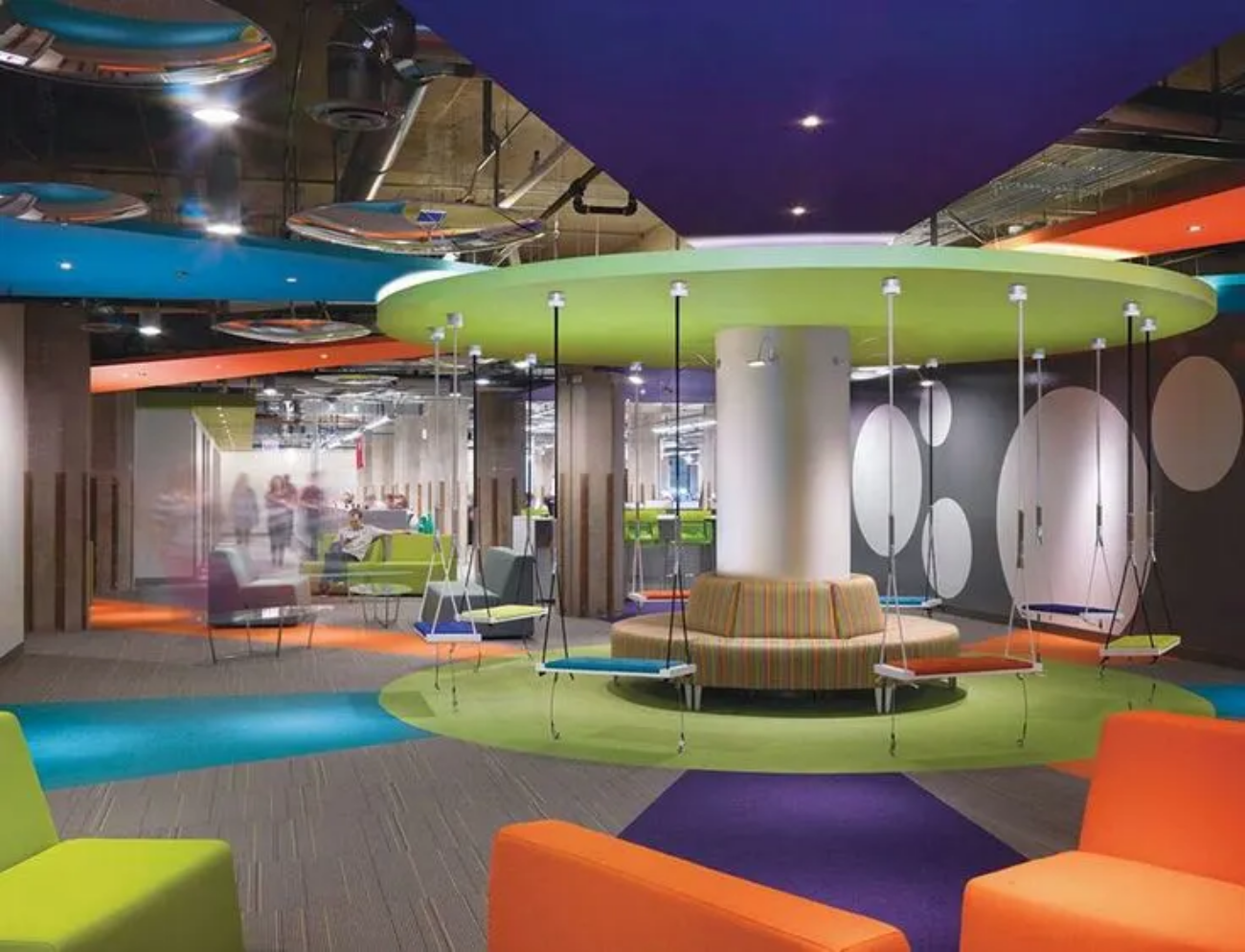
Use color schemes that represent your company’s brand in order to maintain uniformity across the office space. Including brand colors in your office design solidifies the connection between your workspace and brand identity, creating a united environment that appeals to both employees, clients and visitors.
3. Put the Popular Modern Office Paint Color Trends in Action
Neutral Tones for the Sleek Factor
Neutral tones such as white, beige, gray, and taupe give a minimalist, chic look that works best for contemporary workplaces. These colors are leading the chart of modern office interior design trends as they can be flawlessly fused with new-age furniture. Muted shades can brighten up any space and make it look more roomy while also offering an adaptable backdrop that complements most decor ideas to bring in a professional vibe.
Bold Accent Walls
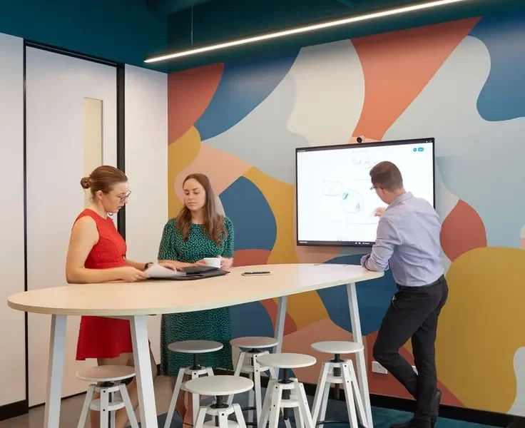
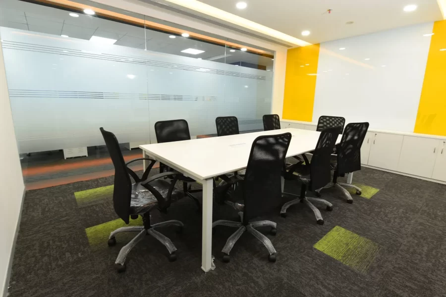
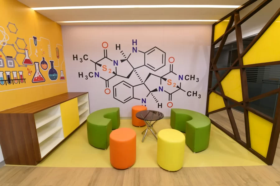
Introducing a striking accent wall in shades of blue, yellow, orange, green, or any of the previously-mentioned peppy colors can infuse creativity and vitality into your workspace. These colors break out the monotonousness of a regular workday providing employees with captivating focal points. Accent walls are especially a hit in meeting rooms, breakout areas, or communal spaces where employees meet up, brainstorm and collaborate.
Pastels for a Calm Work Environment
For companies that want to take a different path to painting the majority portion of their offices in neutral colors, can go for pastel shades like light blue, gentle green, and pale pink. These soft pastel hues are ideal for work spaces where focus and clarity are crucial, such as private offices or conference rooms. They cultivate a serene and easy-to-concentrate atmosphere that aids in decreasing stress and increasing attention levels.
4. Choose the Best Paint Colors for Different Office Spaces
Reception Areas
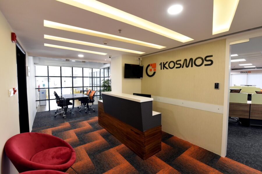
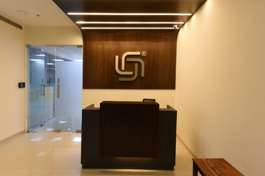
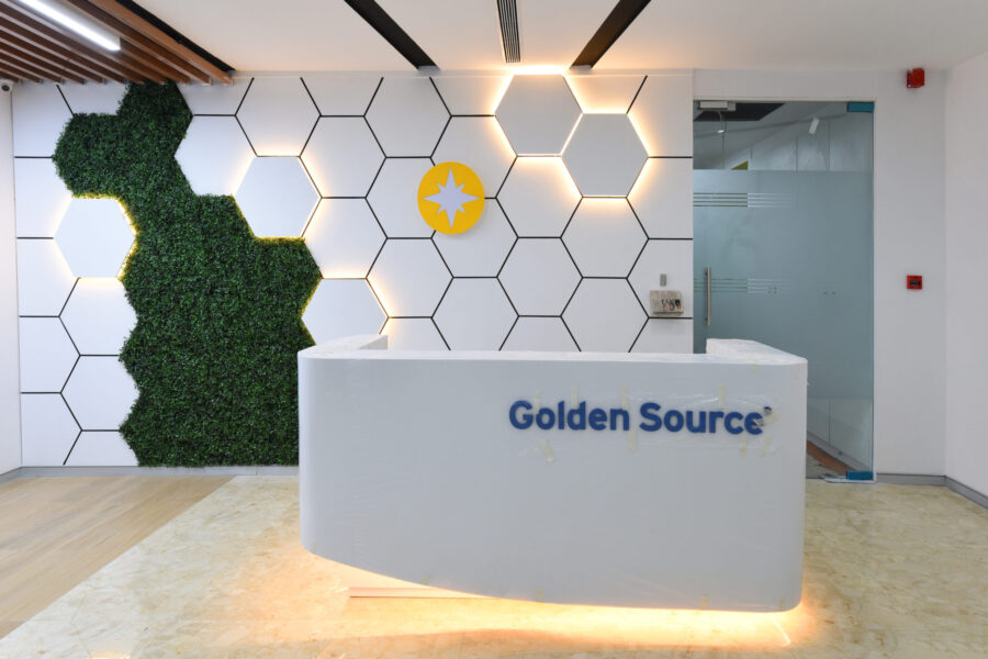
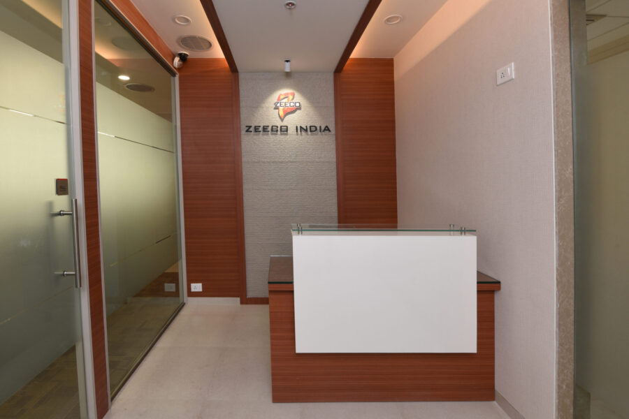
The reception area is where first impressions are made. So choose colors that are welcoming. Shades like soft gray, beige, or warm neutrals paired with some metallic accents here and there give off a sophisticated and inviting vibe. These tones project a refined and feel-good atmosphere, which reflects the company’s professionalism and helps visitors to feel comfortable. Install the right office lounge furniture that goes with the color palette and your reception area is good to go!
Workstations and Open Offices
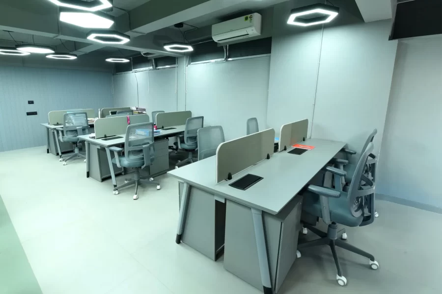
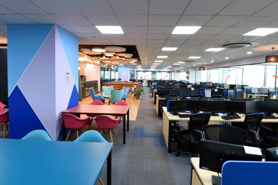
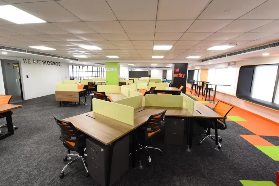
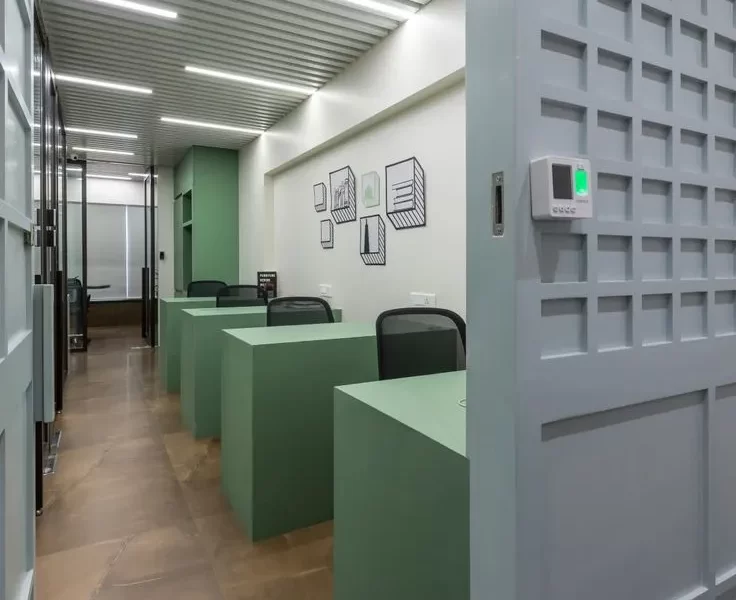
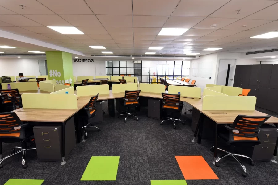
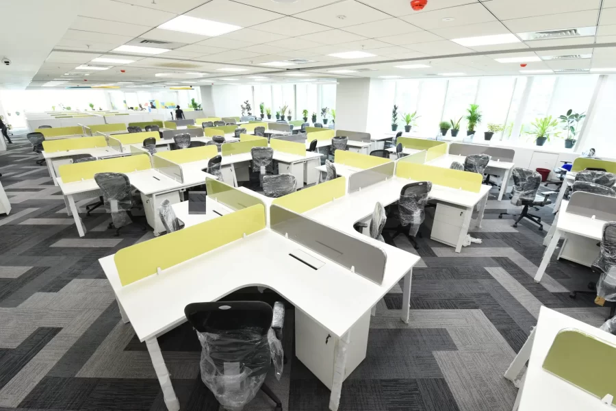
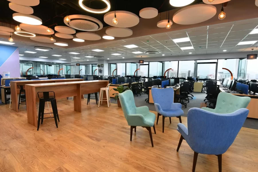
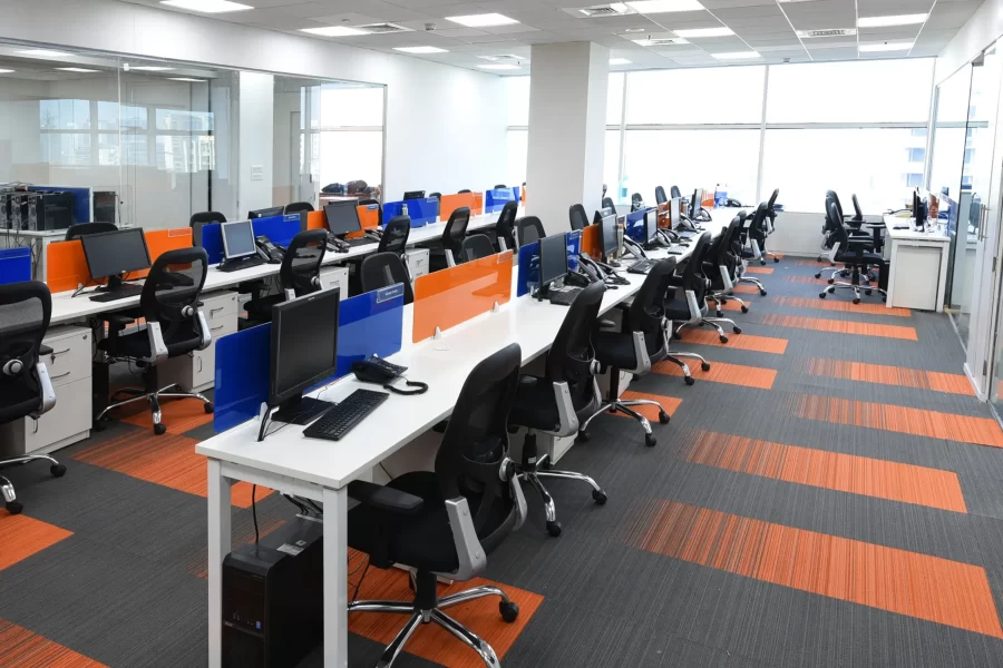
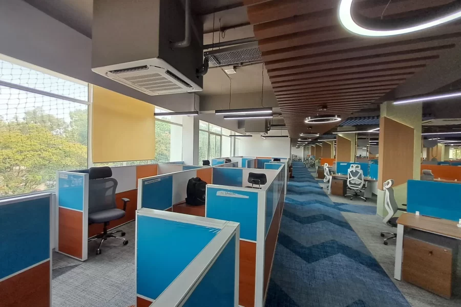
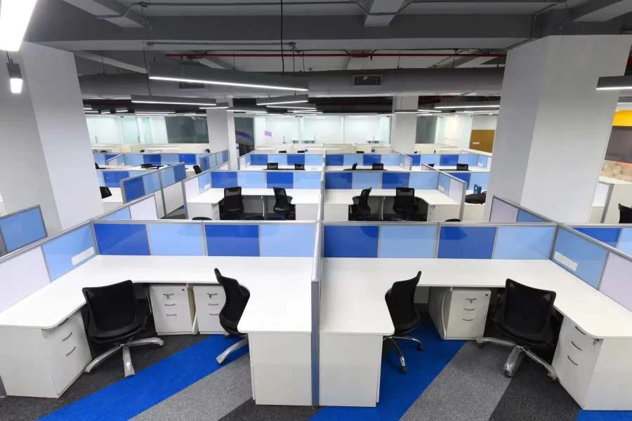
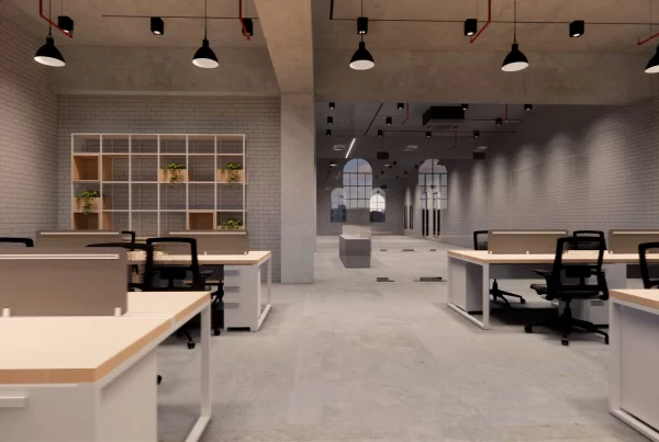
Drab-looking workstations are a strict NO! Introduce workstation partitions where employees can focus better and feel motivated to carry out their daily tasks. Cool neutrals like white, ice blue, muted green or a warm hue like the lightest shade of brown, etc., create a perfect harmony, essential to channel a soothing yet energetic environment. These colors help employees stay focused in open-plan layouts without being too distracting or overwhelming.
Conference Rooms
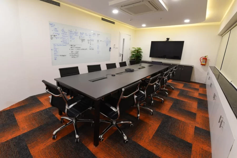
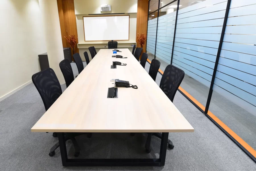
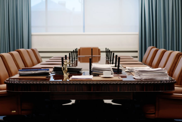
Conference rooms are places of decision-making and collaboration, so deeper shades like navy or charcoal are ideal. These colors promote a feeling of seriousness and importance, aiding in maintaining focus during discussions. Simultaneously, these shades add an elegant and contemporary touch to the room, turning the space into a sophisticated chamber.
Breakout Spaces and Lounges
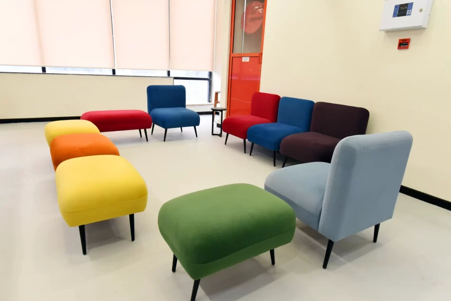
Breakout areas are all about relaxation and creativity. Revitalize these areas by injecting them with vibrant hues such as yellow, orange, red, green or purple. These bright and cheerful yet striking tones create a playful and inspiring atmosphere, encouraging employees to relax and tune into some fresh ideas. Casting up such uplifting colors in breakout zones instills a feeling of liberation, which works great in rejuvenating employees during breaks.
5. Pair Wall Colors with Office Furniture
Matching Modern Color Palettes with Furniture
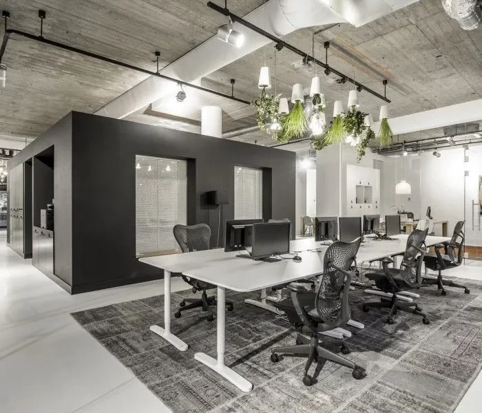
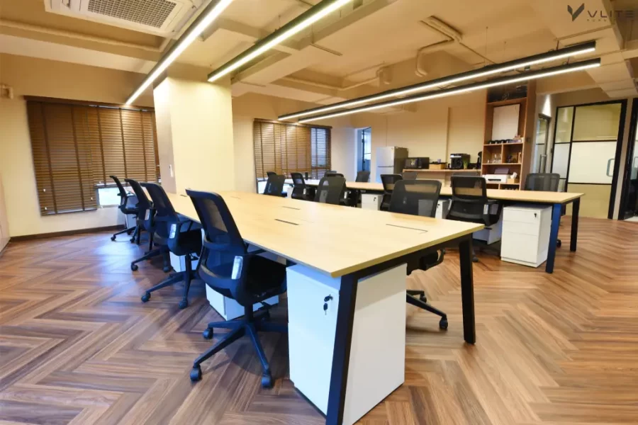
The right colour combinations between wall colours and office furniture can help you achieve a well-coordinated look. For open-plan layouts and minimalist furniture, your safest bet is to choose shades like light gray, white, or other muted tones as they give the space a contemporary and clean aesthetic. These hues complement the simple lines and subtle styles of modular office furniture and keeps the area spacious. When you keep the colour palette subtle, the furniture can easily merge with the surroundings, creating a unified and well-planned layout.
Contrasting Bold Colors with Simple Furniture
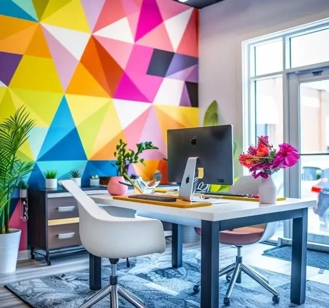
Bright wall paint colors such as dark blue, vivid yellow, or rich green adds energy to a workplace when combined with modest, neutral furniture. This contrast contributes to a lively yet balanced aesthetic, with the bold walls drawing attention while the furnishings emit a smooth, contemporary foundation of the space. Neutral desks, chairs, and storage units in colors like white, gray, or wood tones keep the workspace grounded while maintaining a modern vibe that doesn’t feel too overpowering. This combination of daring and minimal brings some liveliness to an office that looks professional as well.
Common Mistakes to Avoid When Choosing Office Paint Color
- Don’t go overboard with bold paint colours for your office wall. Vibrant shades can bring energy to a space but overusing them in any wall design concept can quickly become overwhelming. So, instead of painting entire walls with vibrant hues, use them strategically as accents.
- Remember, natural light is your best friend! It can help you understand how colours appear in a space. A shade that looks perfect in one room may feel completely different in another. So before settling on a paint colour, observe how the light shifts throughout the day and choose shades that complement the room’s natural brightness.
- Stick to your office’s theme. Pick modern office paint colours that go with your brand identity. Create a consistent look so that every aspect of your interior decor — be it furniture or artwork strengthens the company values.
Get All the Furniture that Suits the Color Theme of Your Office from Vlite
The atmosphere and productivity in a workspace gets majorly affected by the office paint colours used in the space. Shades and designs that mirror your workplace culture can establish an inspiring and welcoming environment. When these office color schemes are paired with the right assembly of ergonomic modular office furniture, the appearance of the workplace magnifies at a larger level, turning the entire interior concept into a unified design. Vlite Furnitech offers bespoke office furniture solutions that will match all sorts of the color scheme and design of your workplace. Check out Vlite Furnitech’s product portfolio and contact us for a personalized expert consultation.
FAQs
Can thoughtful use of office paint colors really boost productivity?
Yes, of course! Informed use of office paint colors can heighten productivity. Countless research shows that color psychology impacts mood and focus, with shades like blue for concentration and calm, green for relaxation and renewal, etc.
How do you choose the best color for office walls, especially in a large office?
Pick neutral or calming colors such as light blues, soft grays, or off-white for coloring the major part of your office, especially large workspace. This approach will prevent the area from feeling too busy. In addition to this, take other decor elements into account, like sunlight, furniture, and the preferred ambience for your office.
Which color is best for office furniture?
The best colors for office furniture depend on your workplace’s theme and the atmosphere you’re aiming to create. However, it’s safe to go with versatile shades like gray, white, black and woody shade, as they look professional. You can add a pop of color in breakout areas, cafeteria and receptions as these spaces are more about unwinding.

